Background
Role: UI/UX Designer, Visual Designer
UASU Perks is an app where students can answer surveys/quizzes, attend events, and be rewarded with free stuff. The gamification of student engagement makes it a fun experience and brings awareness about what various services are offered by the Students’ Union. Moreover, it allows the UASU to interact and listen to students so that they can better advocate for them.
Originally, the gamification concept was developed by a group of University of Alberta students: Andy Li, Kean Weng Yap, Chase Buhler, Marissa Snihur, Ivan Tse, and James Jewitt for their CMPUT 401 class project. The Students’ Union then helped launched it as a beta web app and then later released it as a mobile app for iOS and Android.
Deliverables:
• Visual identity system
• Digital graphics for Instagram, Facebook, SUTV, UASU website
• Mobile wireframes and mockups
Goals
• Develop brand recognition by introducing a new visual identity
• Improve usability of completing tasks and redeeming prizes
• Increase app downloads by using digital and printed promotional materials
Design Question
How might we create a sense of community and encourage student engagement among University of Alberta students through the Perks app?
Process
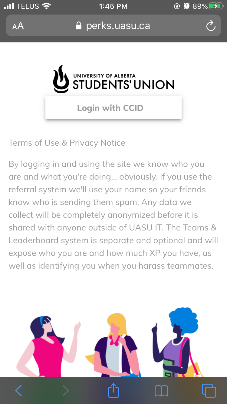
Log in page
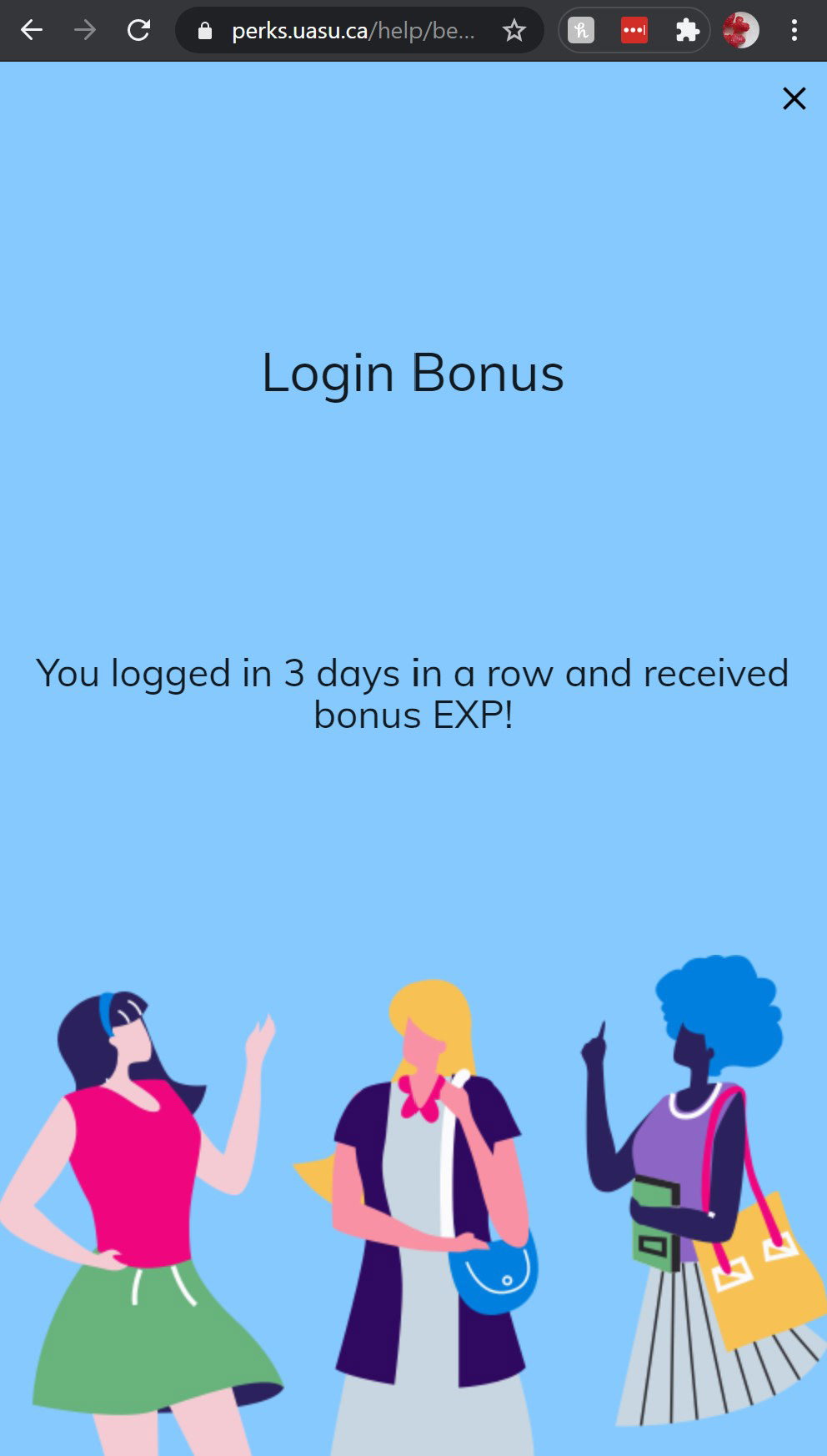
Log in bonus
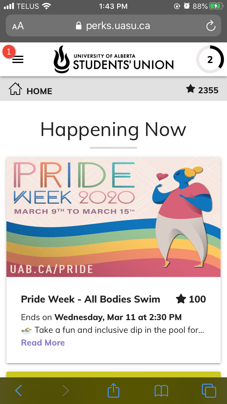
Home page
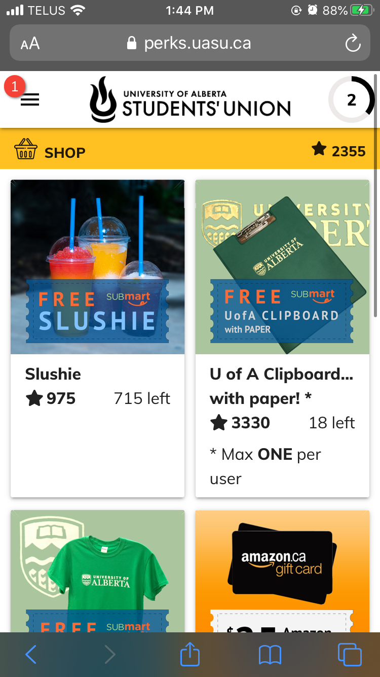
Shop page
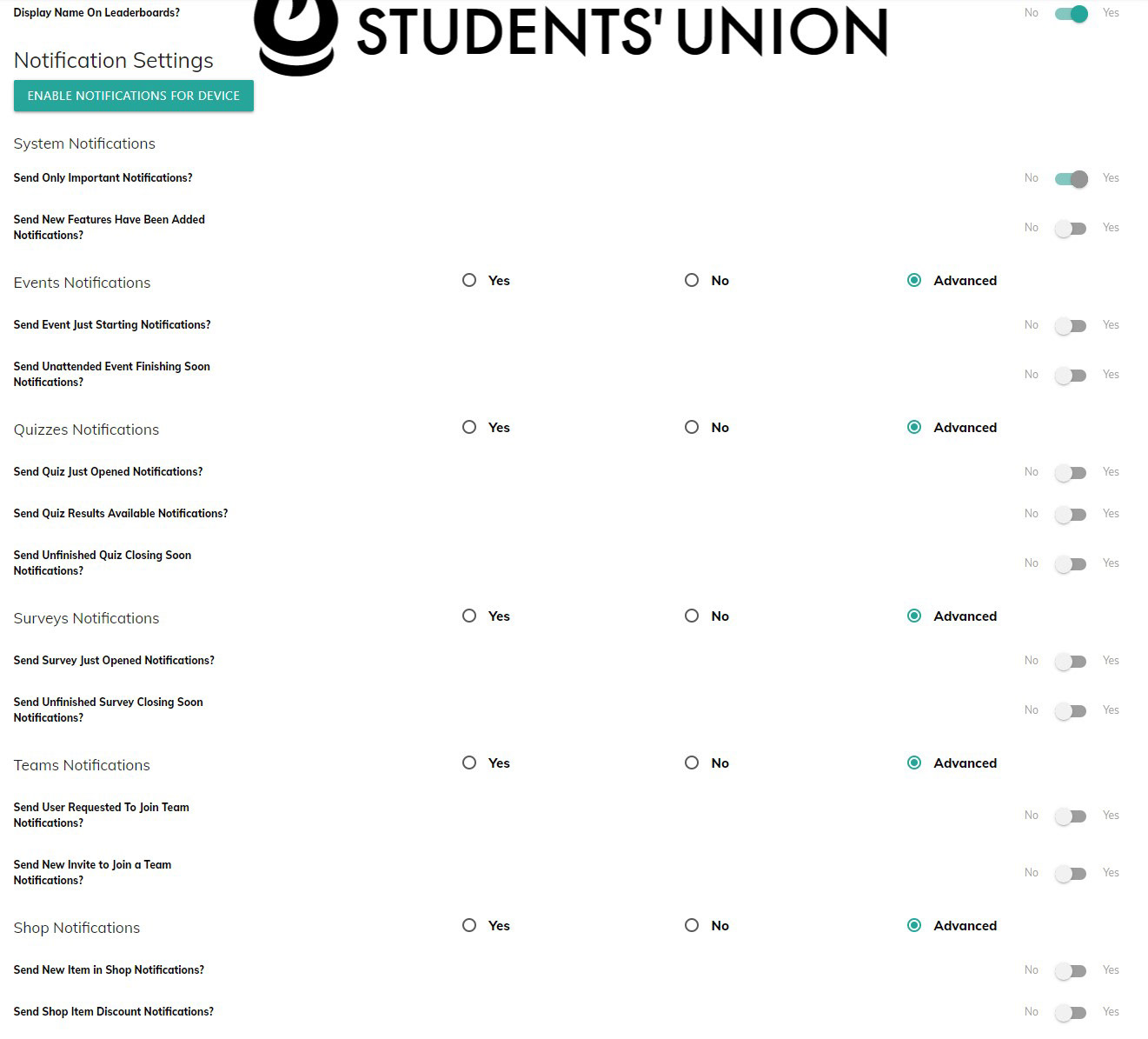
Settings page
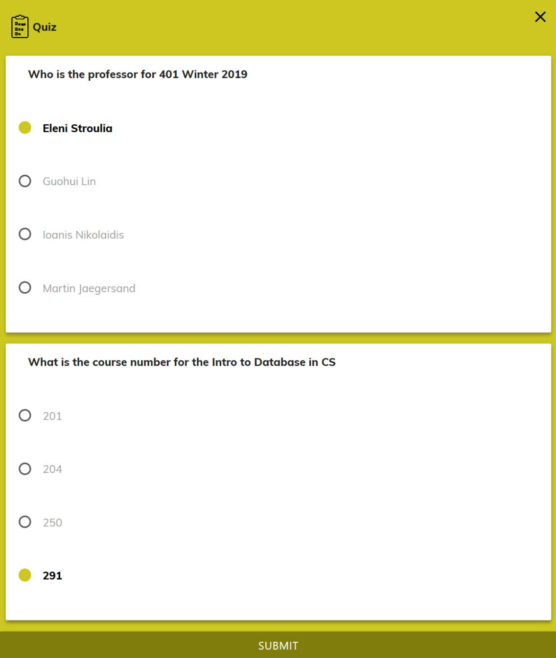
Quiz page
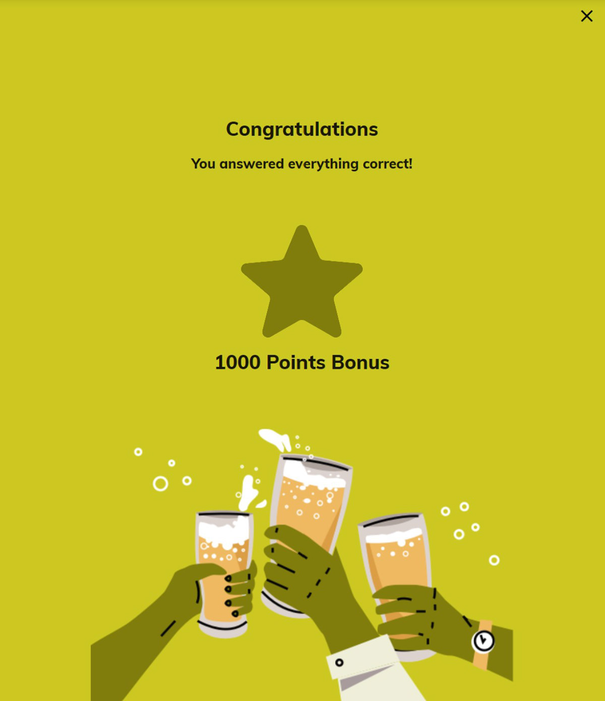
Quiz completion modal
Pain Points:
• No cohesive branding system
• Information architecture of the web app was confusing and overwhelming
• Not optimized for mobile experience (ie. touch targets, responsive grid system)
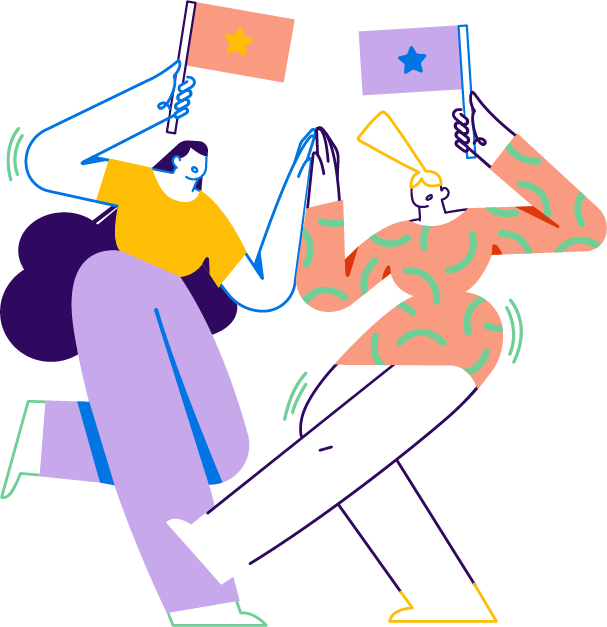
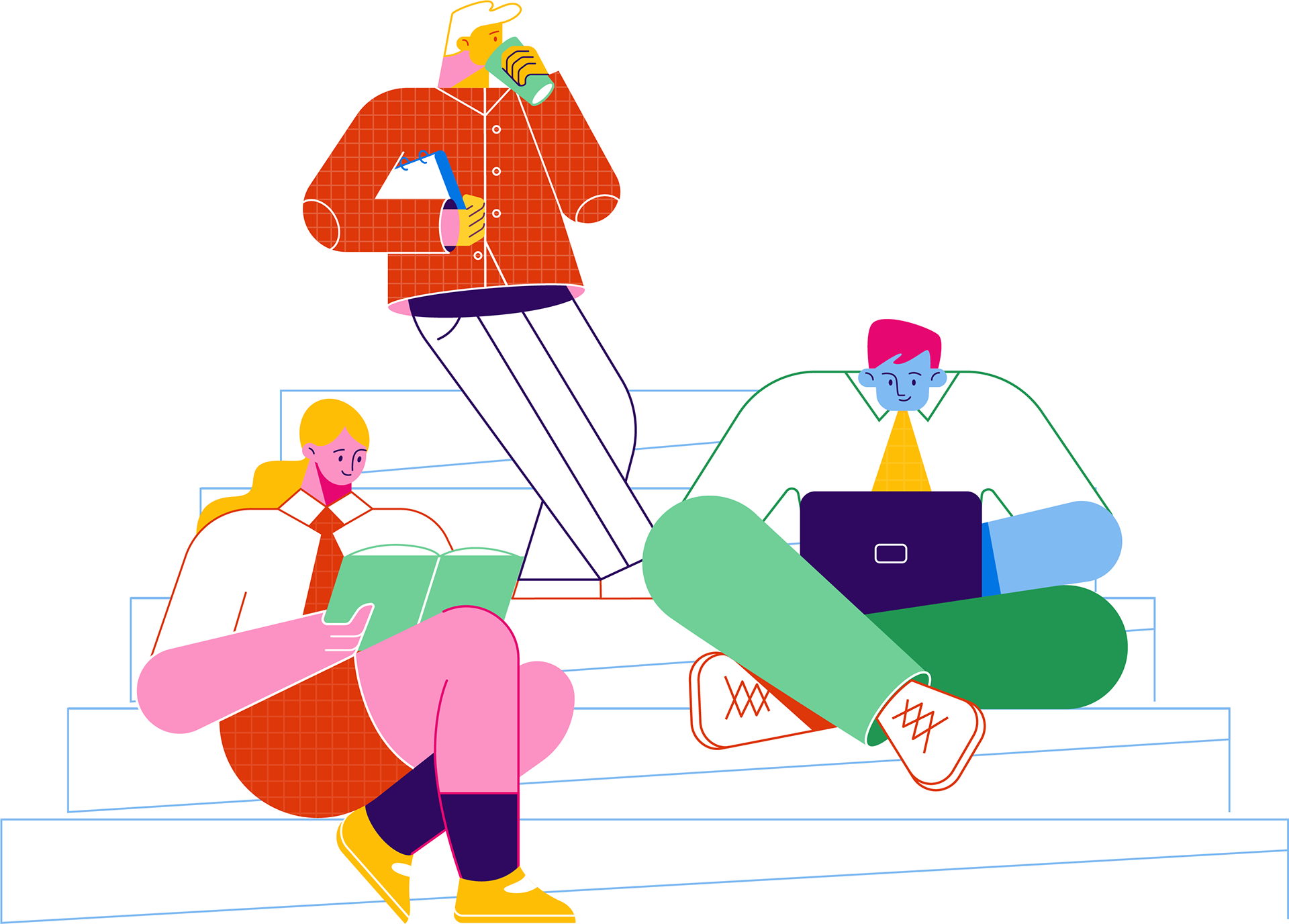

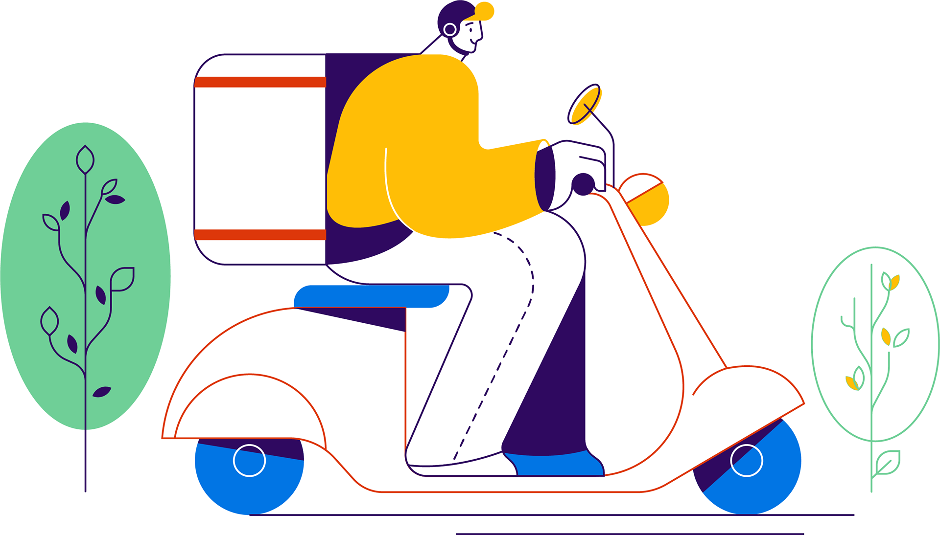
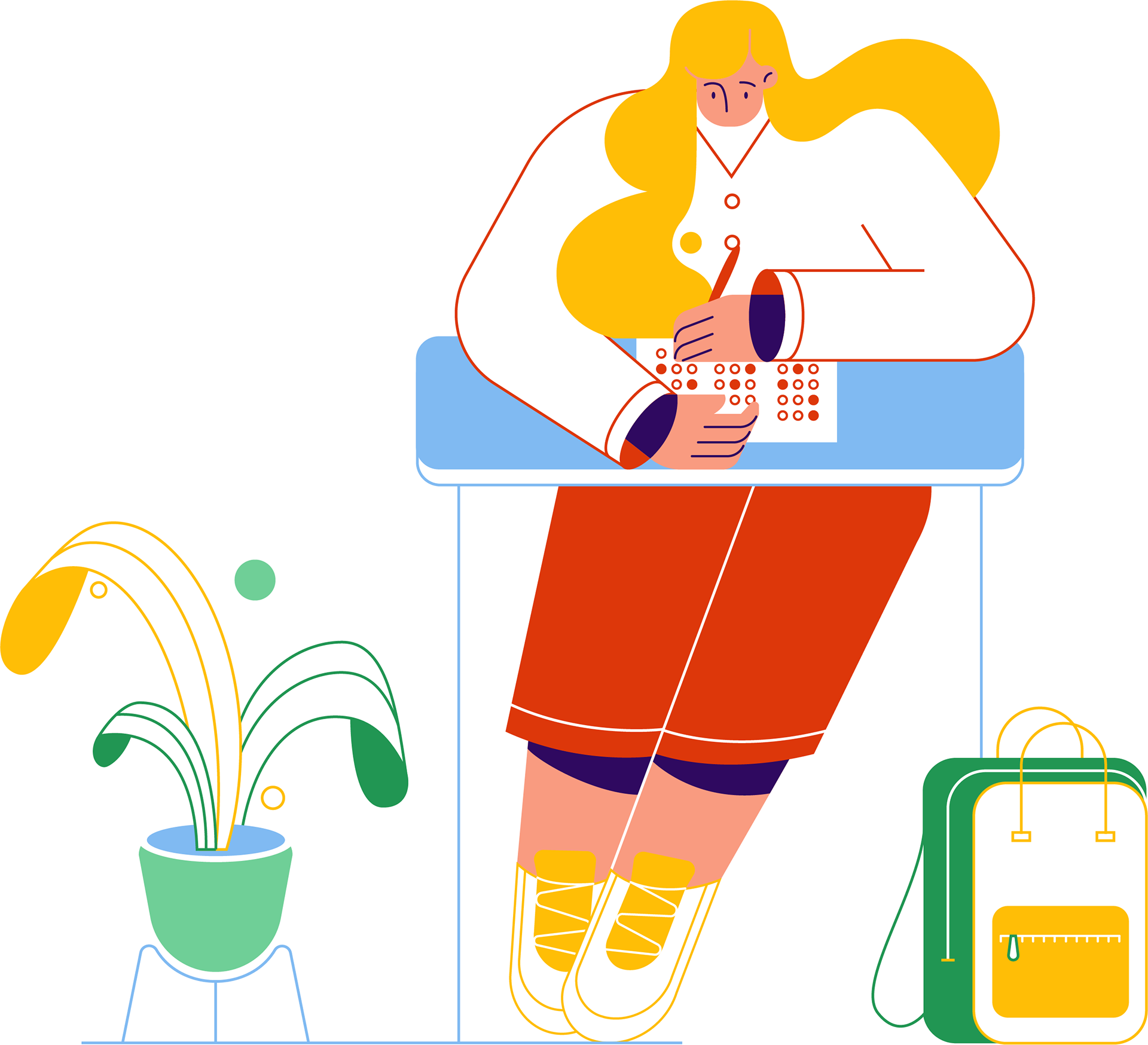
Brand Illustrations
Creating new illustrations was out of scope, so we utilized these beautiful pre-made sets offered by DrawKit and incorporated Perks’ brand colours.
Solution
Revised IA
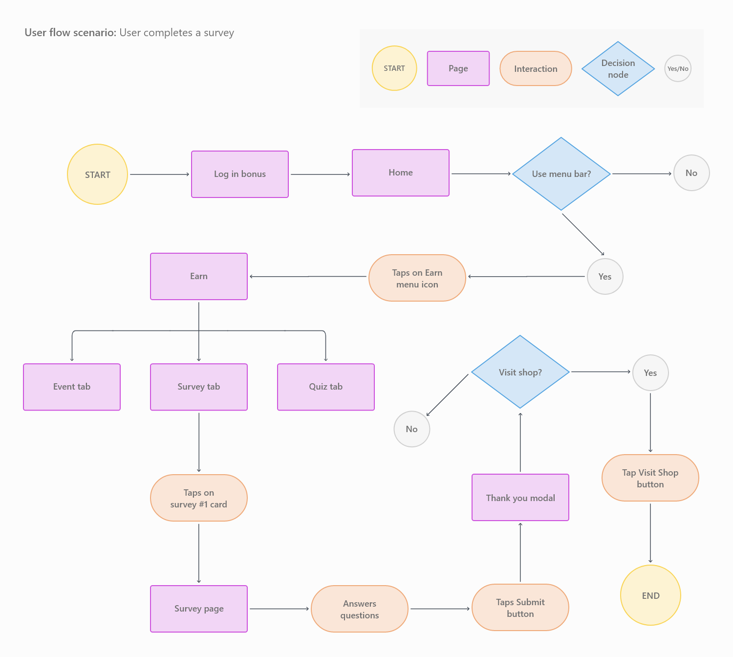
Completing a survey flow
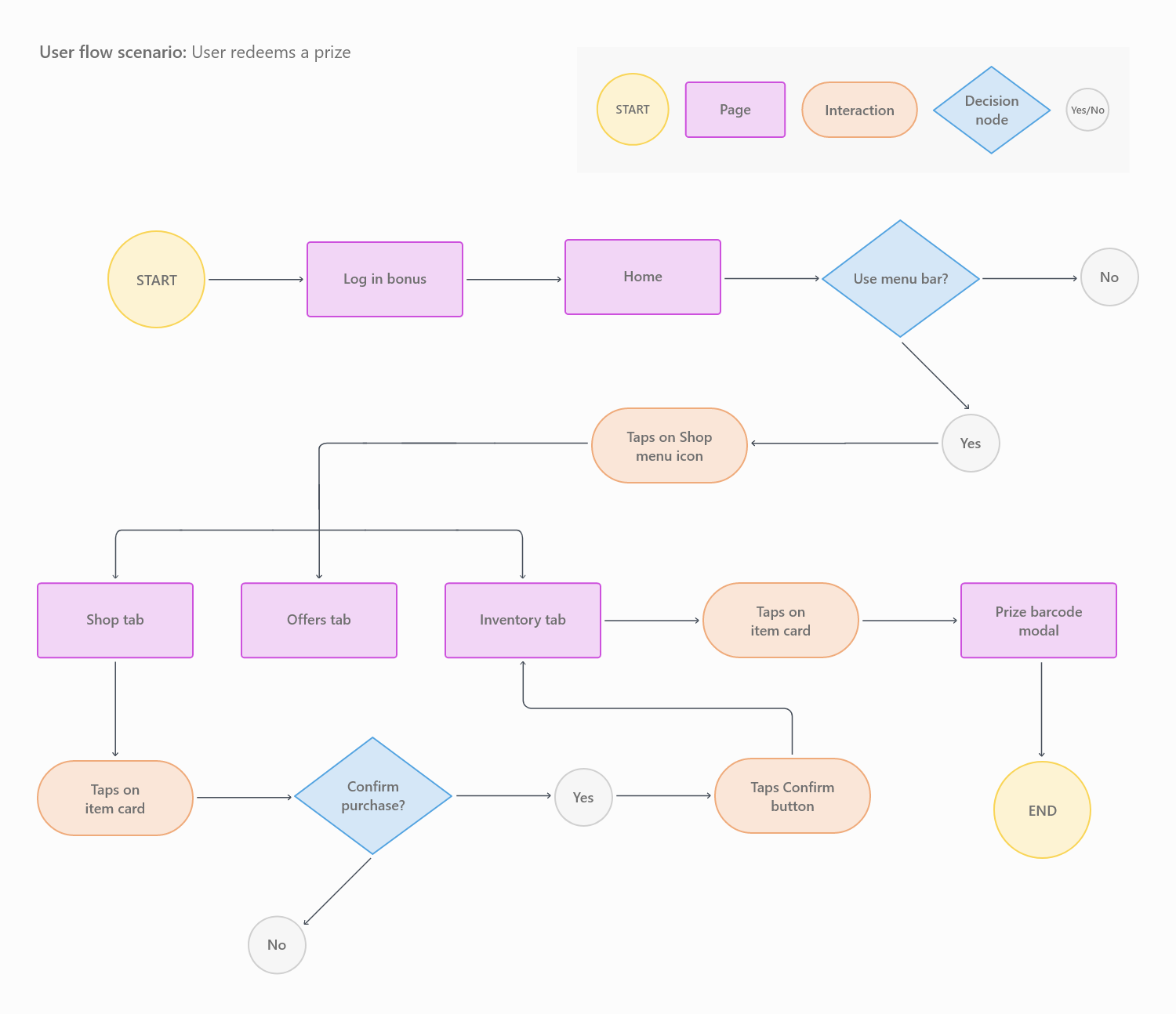
Redeeming points for a prize flow
Perks Stats (Last updated April 2022)
Android: 1152 Lifetime installs, 773 used in the last month
iOS: 3700 Lifetime installs
Users: 17,930 unique users have logged into Perks
Peak: 4786 people using it in a single day
Prizes: 3397 prizes have been awarded this year
@uasu.alberta / Instagram
@uasu.alberta / Instagram
Reflection
Redesigning the UASU Perks app was an exciting challenge. I'm thankful to the Marketing and Development team at the UASU for tasking me with this project. It was very fulfilling to design an app from infancy all the way to deployment. In retrospect, there are several areas I would improve:
Web Accessibility: While proper colour contrast and heading structure were considered, other areas such as designing for screen readers and touch targets could have been better.
Design components as a design system: This would ensure consistency, provide an overview of different states, and have easier developer handoff.
User testing: Minor usability testing was completed but I was not included in the process and lacked knowledge of what was tested and how.
Dark mode: This was out of scope. If implemented, it would have given the user the choice to pick between dark mode and light mode depending on their preference.
iOS and Android: It would have been nice to distinguish and polish these 2 different platform experiences.